I’ve always loved the idea of a color palette being inspired by gem-tones – emeralds, rubies, and deep sapphire blues, but blue particularly sticks out as an easy color to work into any room because it’s subdued and oh so versatile. I combed through Pinterest for different ways designers have incorporated blue into interiors, whether it be in the details or as a main element of the room. Check out this bluesy inspiration…
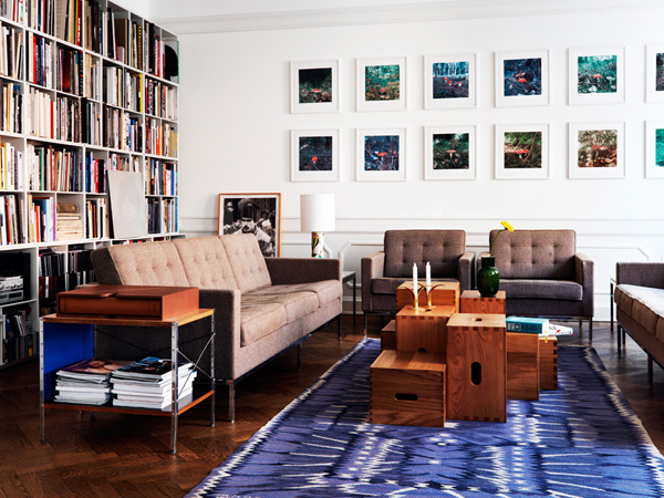
This rug (in the first shot above) packs a lot of punch into this neutral living space. The only precedent for this injection of color would be in the photos on the wall (and there is also a bit of cobalt on the inside of the side table), which shows how well it can be paired with brown and tan neutrals.

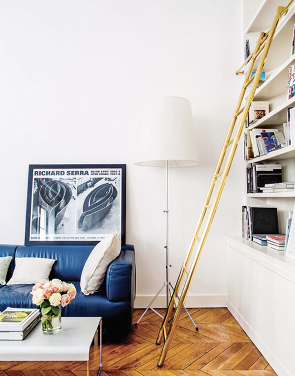
Blue leather? Why not! Not only is it unexpected, but this color can sneak into a traditional room to spark some interest in the color palette. This interior also succeeds in demonstrating how successful blue can be in an otherwise neutral room.

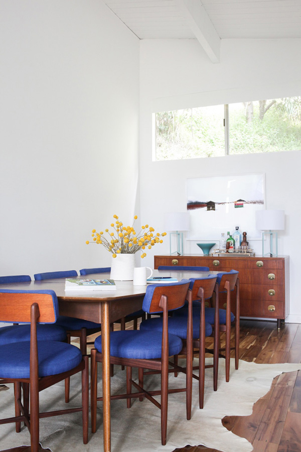
The blue in this dining room is crucial to anchoring the whole setting. The tabletop and cowhide rug are both pretty light, so without a strong color on these chairs the whole room would lose its contrast. I also think that this certain hue feel appropriate in the mid-century style dining chairs.

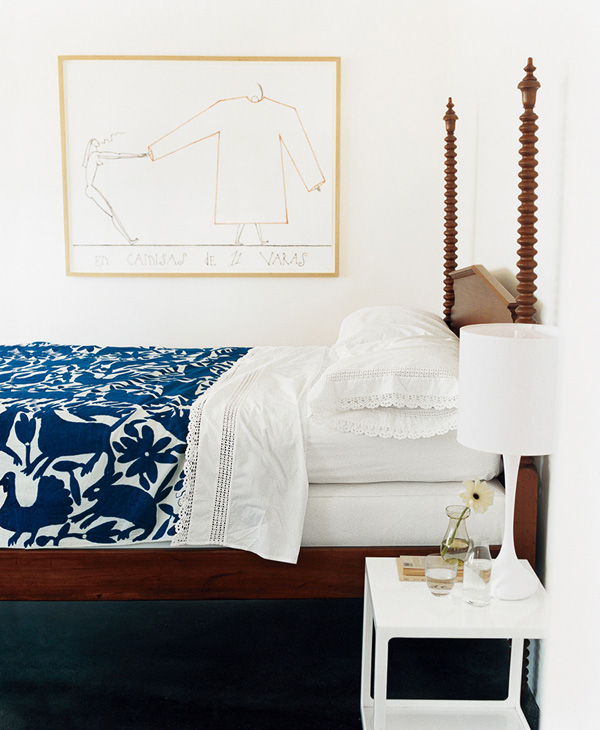
Blue is perfect for bedrooms because it’s a nice cool and calming color. I love the pattern on this bedspread, and especially in blue! The richness of the dark blue matches the richness of the wood of the bed frame, creating a nice focal point to the room.

Last but certainly not least, this cobalt doorway may certainly well be my favorite interior detail I’ve ever seen. I think the trick to this design stunt is to have pretty thick walls, so that doorway really stands it’s own in the context of the two rooms it divides. Also, like the article states, it’s got to be a color that doesn’t come directly from the room’s color palette.
I hope you’ll join me in my blue period, because I consider blue one of the easiest colors to incorporate into your home. It’s cool and calming, accentuates purples and greens, and complements anything from yellow to red, brown, and white.


0 comments
Note: Only a member of this blog may post a comment.